I love browsing real estate listings. I am constantly on the lookout for a bigger house for our family (there are six of us in about 1400 square feet), but I also just enjoy perusing anything related to architecture and design. Recently, I came across this great log cabin on Rambling Road in Blowing Rock, NC, near the local ski slopes (Appalachian Ski Mountain). I loved its charm and natural light! The views out the windows are so peaceful. I thought it’d be fun to do a blog post where I share how I’d make over a space that’s for sale. It will give you a chance to see the potential that I see in a property. And if you become the buyer for this home and are interested in my help as you design the home, contact me here through the Canvas & Light Interiors website! I’d love to be a part of designing this home with you!
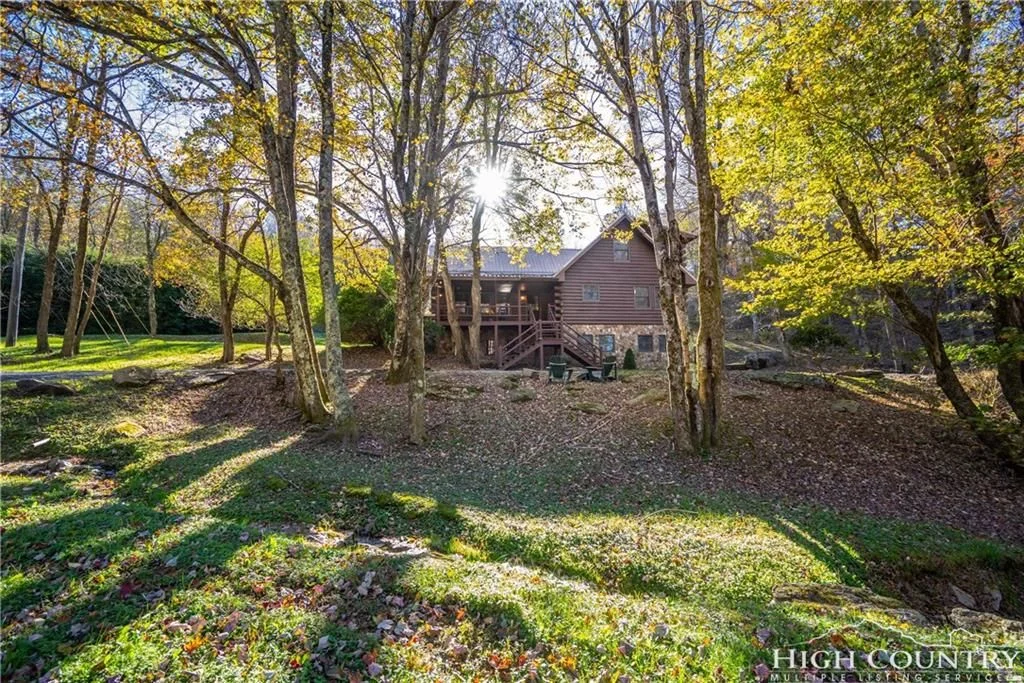
Here is the exterior of 236 Rambling Road, Blowing Rock, North Carolina:
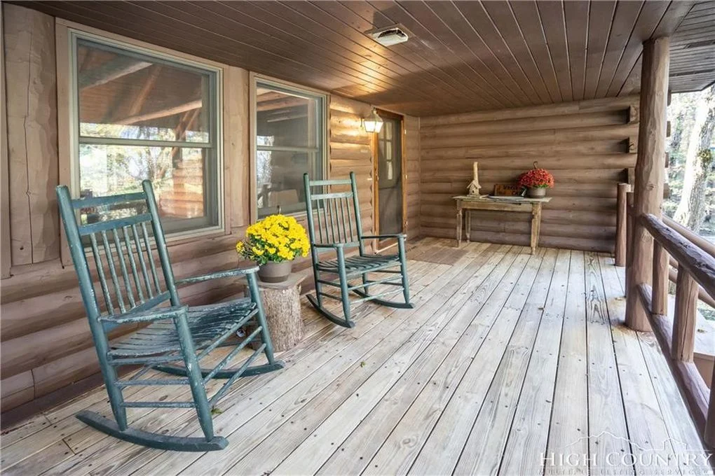
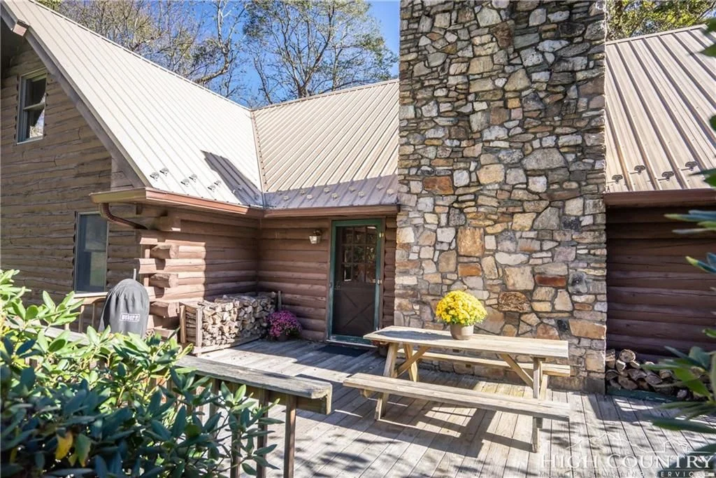
It’s located on a pretty lot and has a small stream running across the front of the property. There is a side deck off of the living room in addition to the front porch and back deck pictured. A short walk around the neighborhood reveals incredible long-range views.
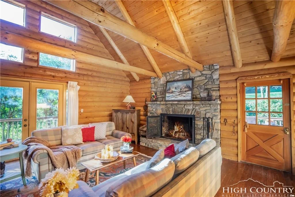
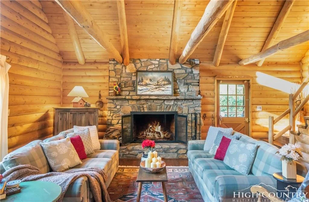
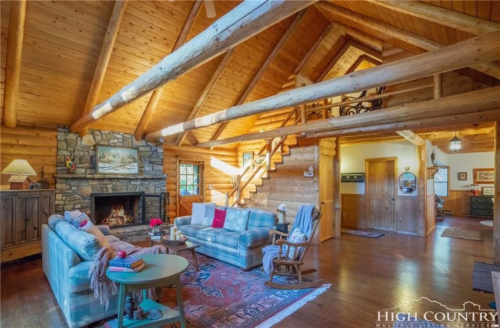
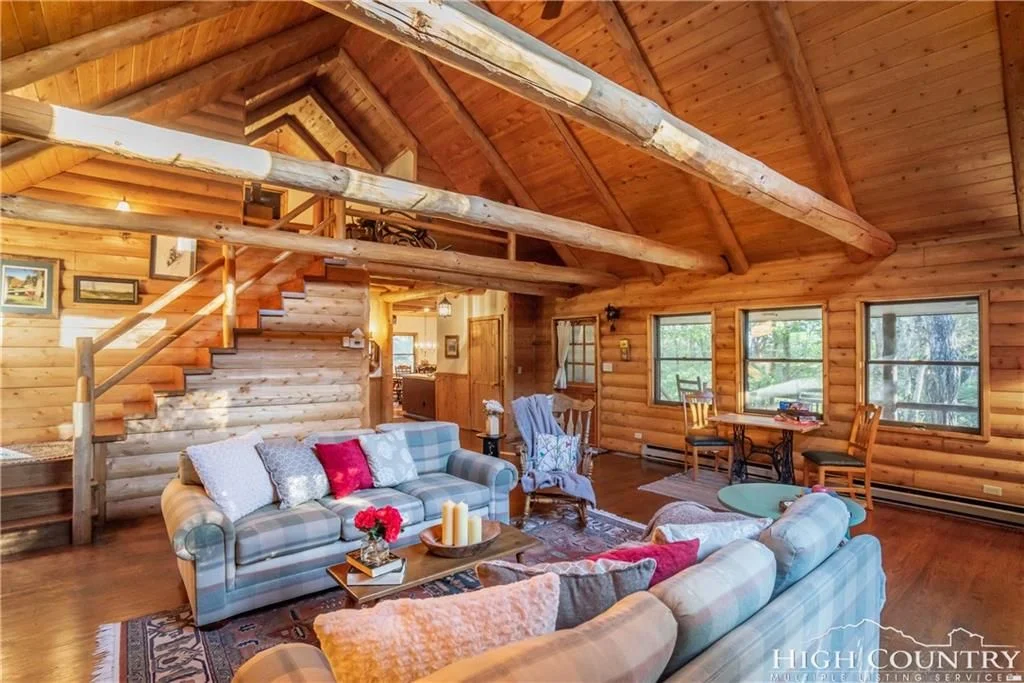
Here is the cabin’s living room:
It’s rare that a room has windows and doors along three sides, so that is a feature I immediately noticed and liked. The vaulted ceilings are brought down to human scale with the beams running across at about 8’ high. The fireplace isn’t overbearing, and the staircase is darling! Isn’t it inviting?
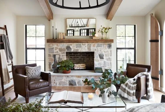
I’d begin by giving the fireplace a makeover. It’s a bit dingy and overly gray-toned. To create more contrast with the log walls around it, I’d cover the stone with more mortar to lighten it and clean it up. The goal would be to create a look similar to this image:
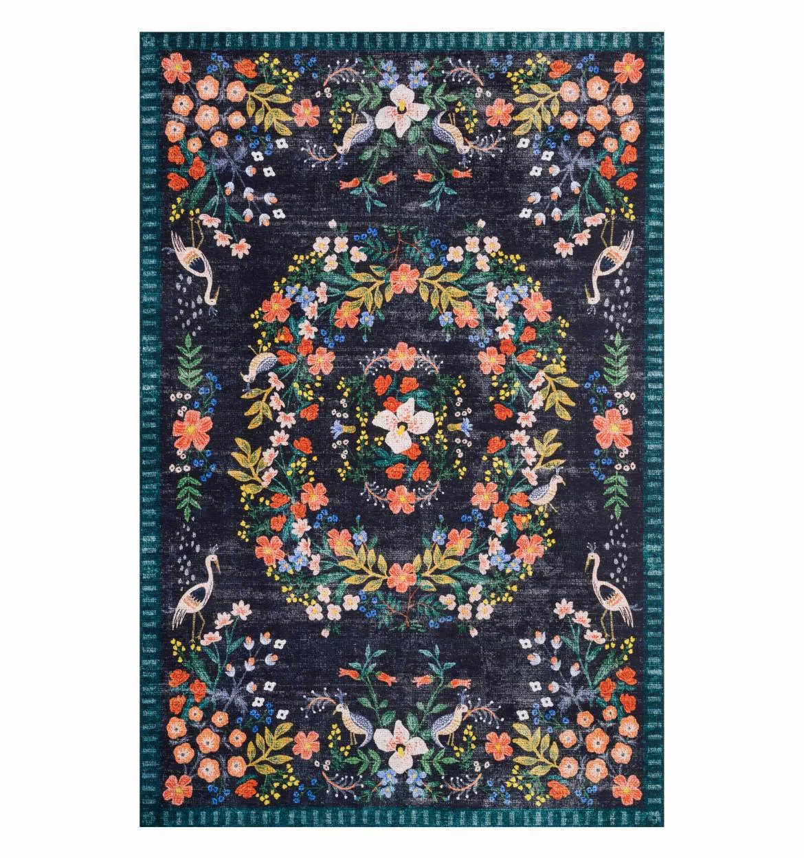
I’d then start designing the space around this gorgeous rug by Rifle Paper Co. :
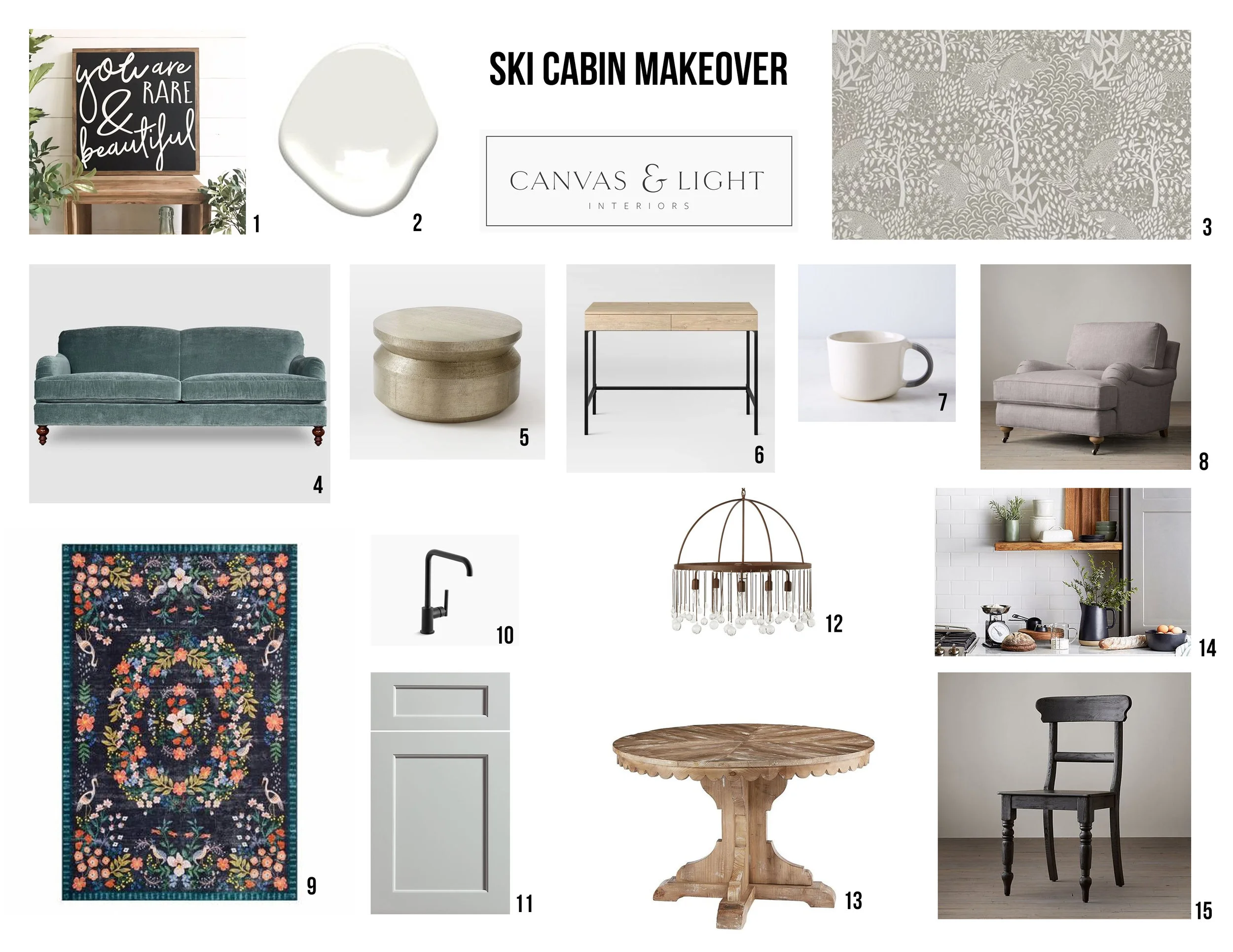
Here’s a moodboard that shows some of what I’d put together with this rug, and it depicts some ideas for the kitchen and other rooms as well:
An L-shaped sectional might even fit well in the living room! I would keep the majority of the home neutral with whites, blacks, and warm wood tones. But I’d love to accent that palette with the color of the sofa in that moodboard – a muted, grayish, blue-green, similar to Beguile by Valspar. I would even add painted furniture in that color to other parts of the house, such as dressers for instance.
Over the mantel, I’d hang a round, brass-rimmed mirror. Mirrors act as another window and bounce light around spaces. I would probably add white curtains to the windows to soften the space, because I love the softness and elegance that curtains add to a room. I’d love to see extra-tall curtains that run from the top of the windows to the floor in the gable of the living room. I know that’s not typical for a cabin, but I’d actually like to decorate this home so that it doesn’t look like the stereotypical cabins in our area. If you’ve ever browsed cabins for rent in the High Country, there is not much variation in how they look.
My vision for this cabin is that it would be unique, and have a Scandinavian, minimalist style, yet still be very cozy and inviting. I’d want it to be a true work of art, with elements that catch your eye in every room, making it a beautiful and inspiring space to be in. I imagine it being a restful retreat and peaceful getaway. Perhaps it would be a second home for someone that they would share with friends and family. Or a place for a writer to come and concentrate on their latest book. Or a place where someone could heal after a loss. It is a sweet cabin, and it could be such a refreshing place for its inhabitants and guests. I can already envision its transformation!
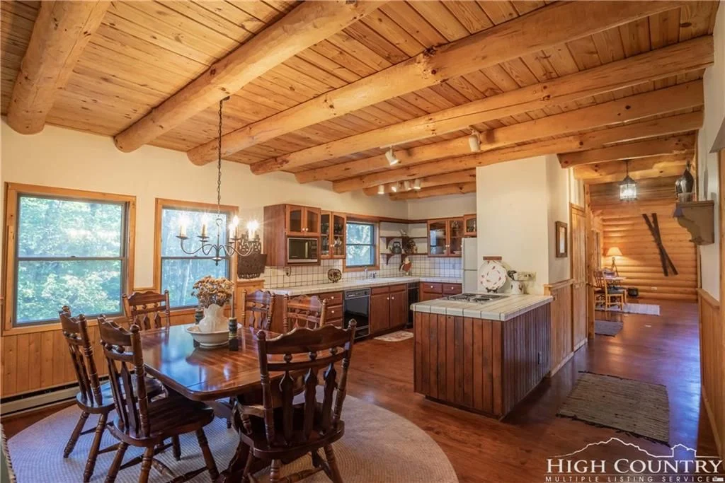
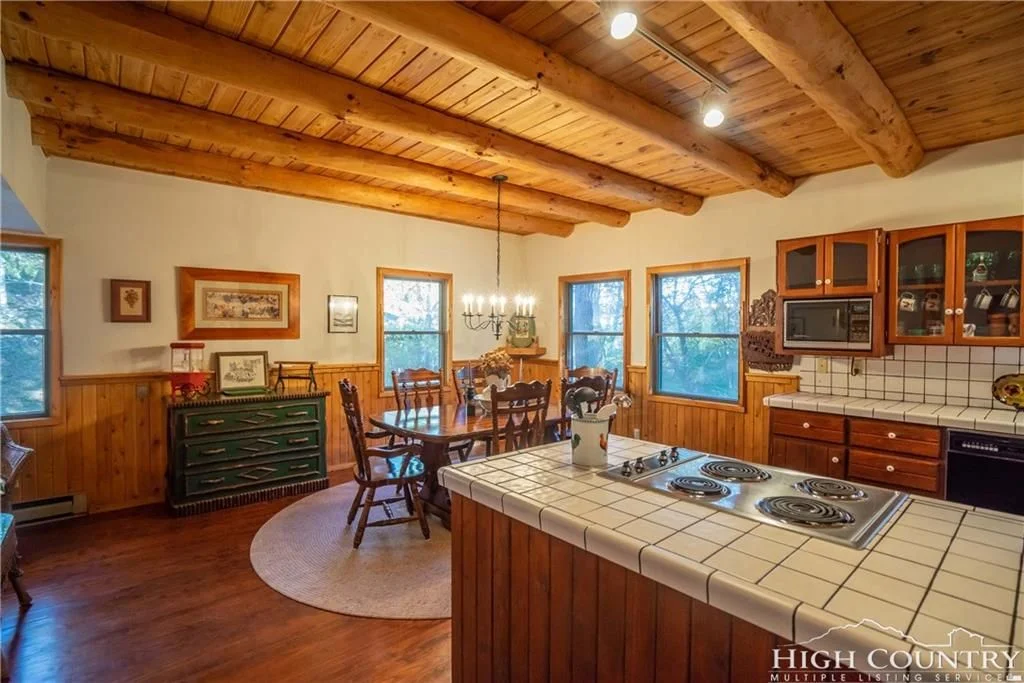
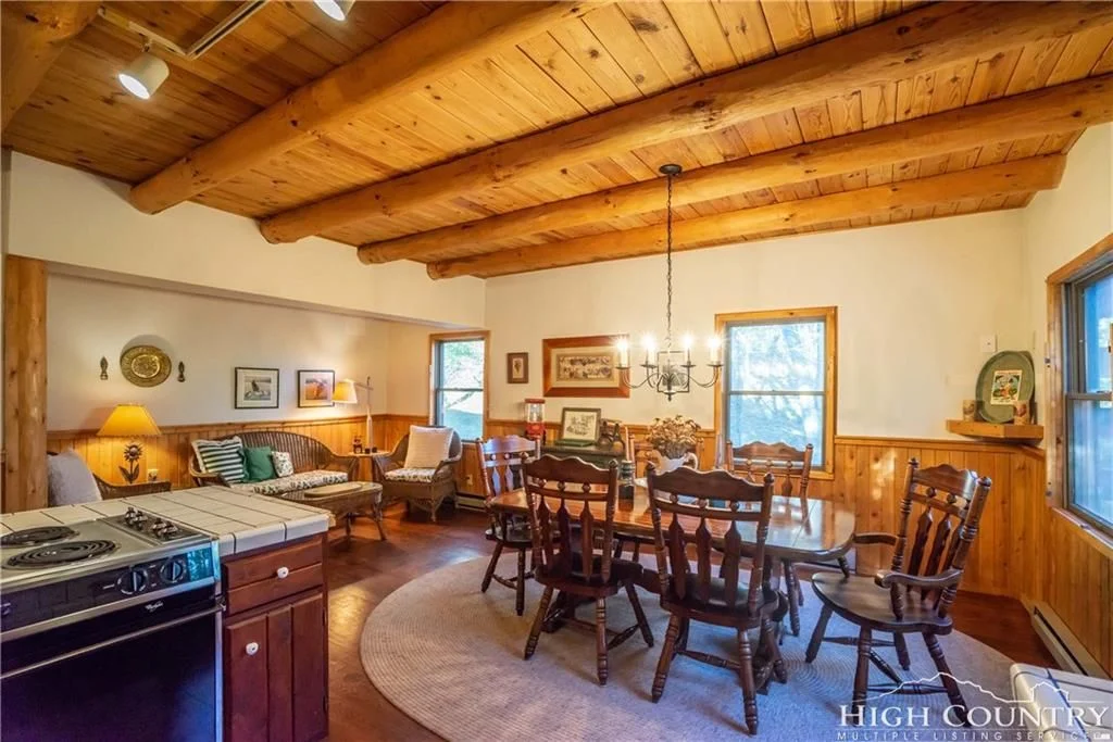
As for how I would redesign the kitchen, let’s first look at current photos of it. Here it is:
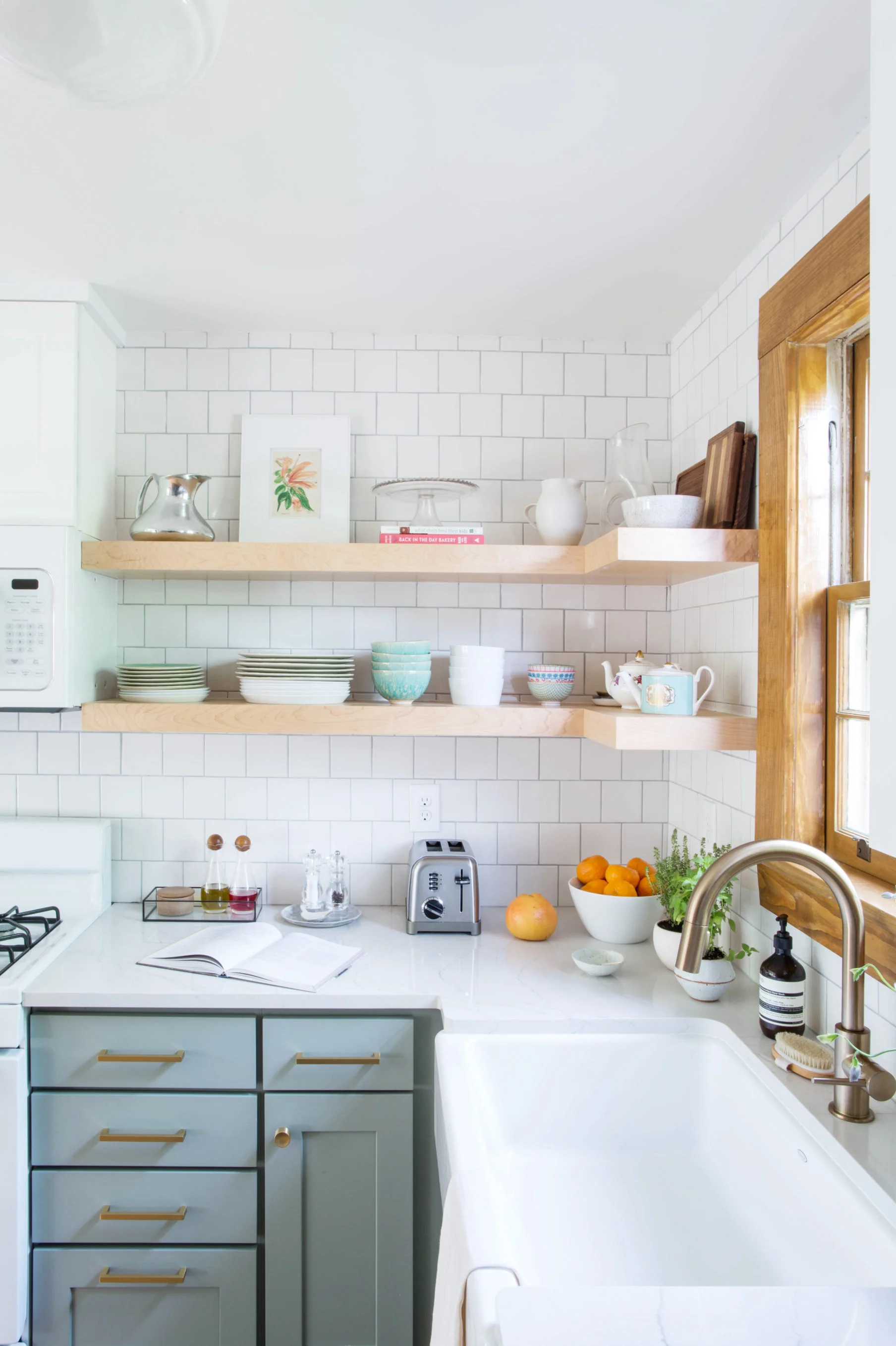
All the wainscoting would get painted white (or be removed) to decrease the amount of wood in this space. I’d overhaul the kitchen completely. I’d choose shaker cabinetry painted a warm, pale gray such as “Smoke Embers” by Benjamin Moore. Instead of upper cabinetry, I’d install open shelving where I’d display handmade ceramic mugs along with plates, glasses and bowls. The counters would be white quartz with a little bit of veining, and the track lighting would be updated to something small, sparkly and modern. The moodboard I posted above shows a possibility for table, dining chairs, and statement chandelier. Hardware would be a combination of matte black and brushed brass. Backsplash would be handmade creamy white ceramic subway tile with white grout. I’d most likely add white roman shades to the windows in this space. I’d like to add original art wherever possible as well!
I love this kitchen from the blog ‘The Happy Tudor’, and I imagine incorporating some similar elements into the cabin kitchen:
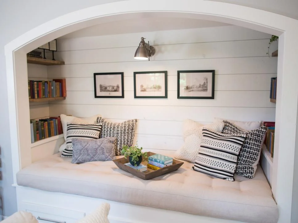
The nook opposite the dining area could be a built-in daybed with built-in bookshelves! Or an office space with a built-in desk. Lots of possibilities for customizing the space and making it completely charming and unique. One idea that came to mind right away was to build something similar to this reading nook which was featured in an episode of Fixer Upper:
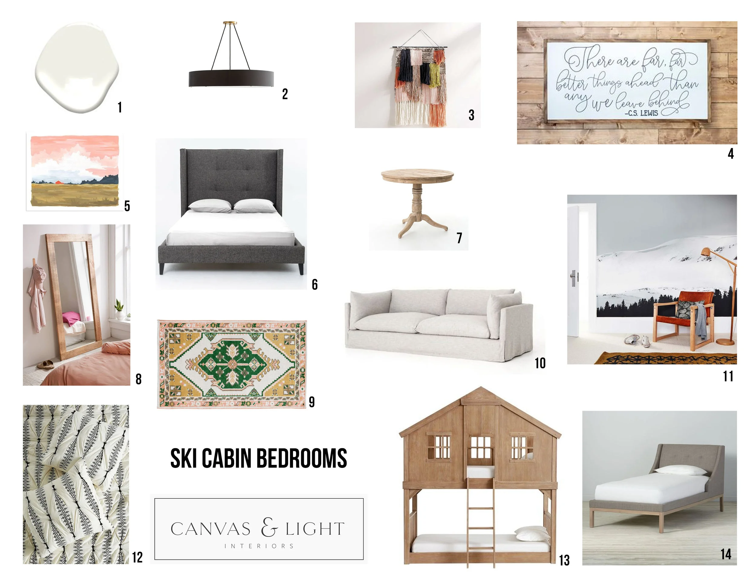
And onto the bedrooms! Here’s a moodboard I created showing some of the furniture, art, lighting, and bedding I’d select to put into the bedrooms (I’d plan on adding a small fourth bedroom in the lower level, if possible):
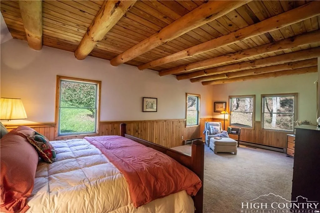
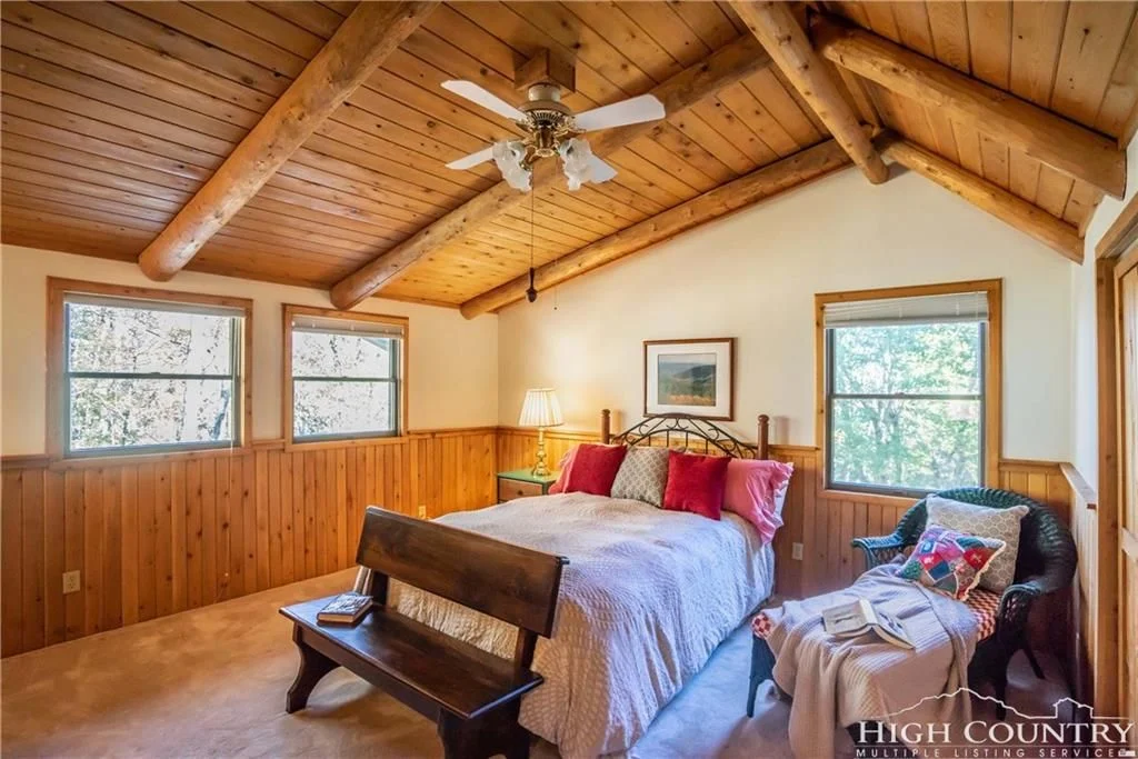
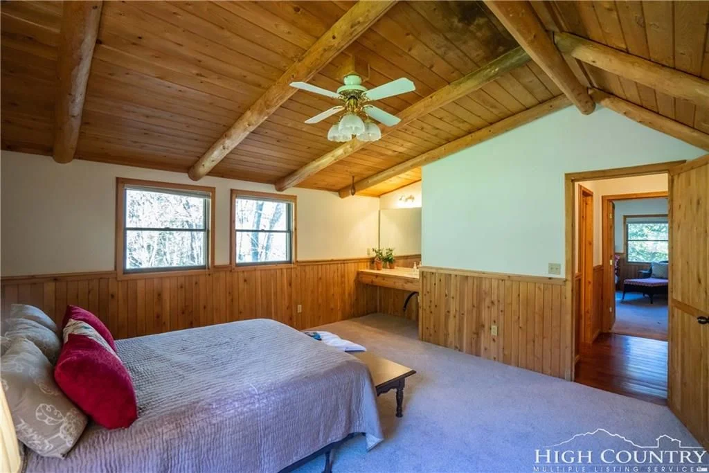
The home currently has three bedrooms, and all of them have windows on two walls, which is a great feature in regards to both ventilation and natural light. Here they are as shown in the listing photos:
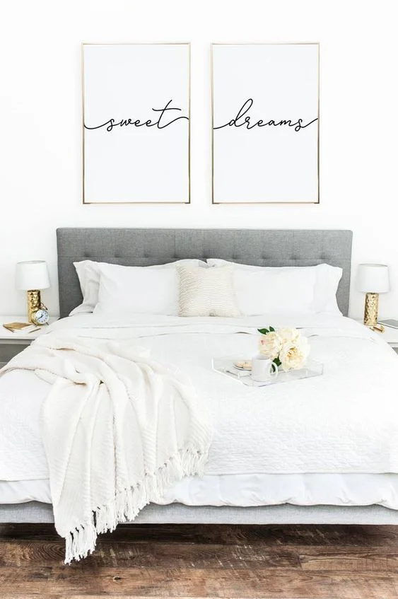
I love the peaceful wooded views! The master bedroom on the first floor has space for a chaise lounge or sofa, and the two upstairs bedrooms have built-in vanities with sinks. As in the kitchen and dining space, I’d paint the bedroom wainscoting white to modernize the space (or remove it completely). I’d add softness via window treatments, and, as seen in the moodboard, the color palette would incorporate whites, blacks, and peachy-pinks, as well as the same grayish-blue-green I mentioned using before. I love the idea of upholstered headboards to offset all the wood in the bedrooms. I’d hang these “sweet dreams” prints above one of the beds.
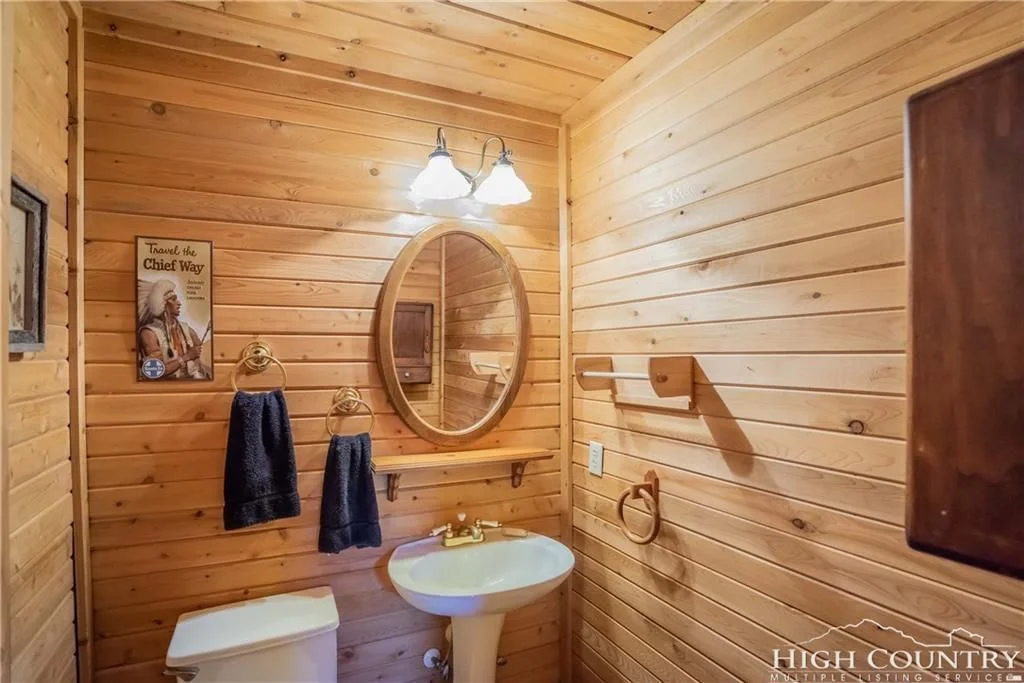
The bathrooms of the home look to be in good shape and would probably only require simple updates and decor changes.
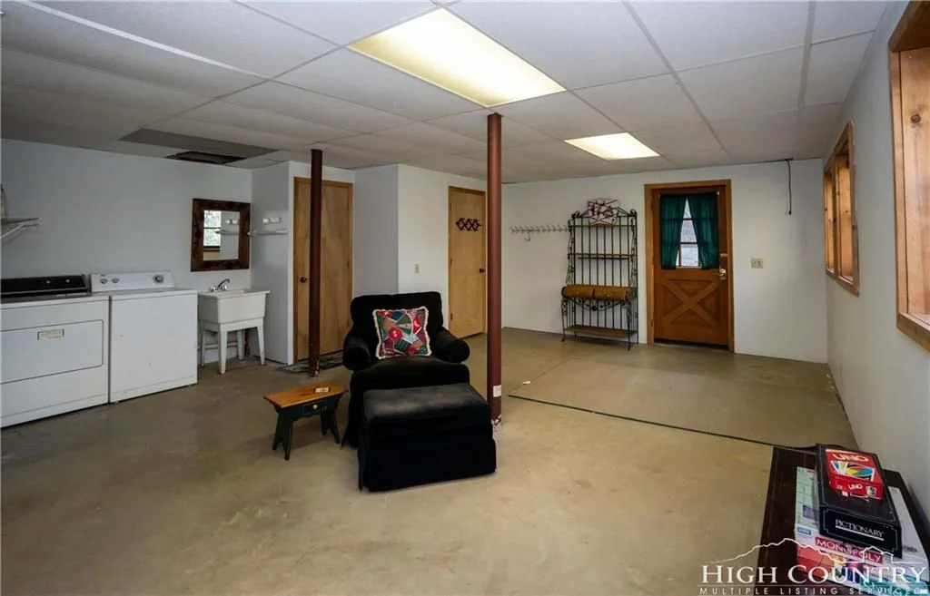
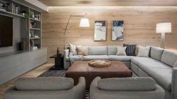
The basement of the home could be gutted and fully remodeled to add more usable and beautiful square footage to the home. I’d design the space to include a second living room as well as another bedroom. (The laundry room is in the basement as well as a full bath and two-car garage.)
This space by Whitten Architecture would serve as inspiration for how I would make over the basement space:
Lastly, I love this fabric, ‘Snow Scene’ by Aimee Wilder, and would love to use it somewhere in the house, such as a lumbar pillow or upholstery for a chair! Perfect for a cabin by the ski slopes!
If you’re interested in a design consultation for your own home, please reach out! Helping clients navigate the design process is always a joy for me. Find out more about Canvas & Light Interiors here: https://www.canvasandlightinteriors.com.

